Five Kitchen Colour Trends for 2019
by Alannah Monks |
Happy New Year to all of our lovely customers!
While 2018 was a wonderful year for us here at Tierneys, we’re excited to move into 2019 with new ideas, new ambitions and new creativity! All the upcoming trends for the year are exciting us but none so much as the new colour scapes. Here we have five of our favourite new colour trends for 2019!
- Glorious Green
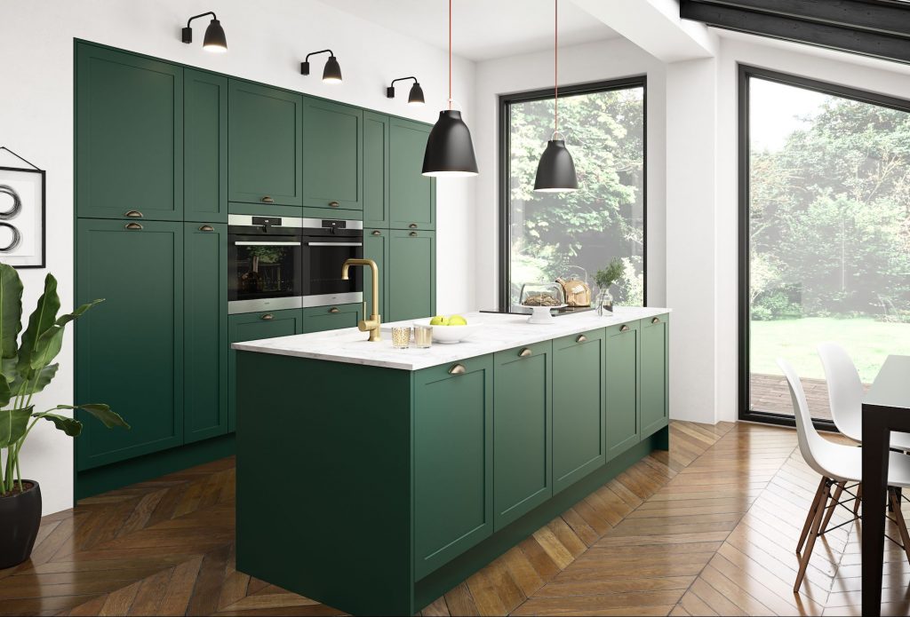
Green has been creeping into our trend books for a while now with the rise of dark kitchens in recent years. Deep and earthy shades like Hunters Green are top of our list for must have kitchens in 2019; this one from UK company Magnet Kitchens is a perfect example of a modern green paradise. Gold and brass hardware complement the bold green beautifully, while a white stone counter is the bright remedy needed for such a deep shade.
2. Nautical Navy
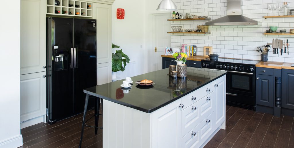
Navy has been a colour staple for quite a while now, some of our favourite kitchens in 2018 were shades of navy. From F&B Railings to the brighter shades of blue, we’ve seen all manners of navy kitchens. But we’re very excited to see a move into nautical combinations, with navy mixed with bright white and pale greys. Chrome hardware and wooden features mix beautifully with this look.
3. Wooden Wonder
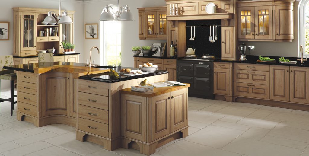
We’re so ready for exposed wood finishes to make a come back! It looks like 2019 will be the year painted cabinetry takes a back seat. Look for exposed wood in oak, limed or stained, or other light woods such as teak or ash. Alternatively, deep stained wood (such as a wenge stain) look fantastic for a modern finsh.
4. Beautifully Beige
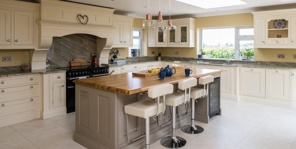
We know! It sounds pretty unappealing, it’s not exactly the ‘colour’ you were hoping for but beige scapes are coming back in a big way for 2019. Keeping everything in a neutral, earthy colour palette is a very classy way of utilizing beige; the key is to stay close to a base colour. You don’t want accents, you just want tones of the same shade. We fit this kitchen a few years back, it always stood out as the perfect blend of beige!
5. Colours of the Year
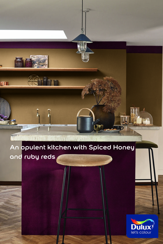
Every year a handful of companies release their colour choices for the year ahead, and the ones to watch are always Dulux, Benjamin Moore and Pantone. Dulux saw ahead to the beige revival and chose Spiced Honey as their one to watch, and we couldn’t love it more! The warm versatility of it is the perfect base for any colour palette, they have paired it with bright red and purple kitchen cabinets which is not for the faint of heart! We would be leaning more toward neutral pairings, maybe even a dusty pink.
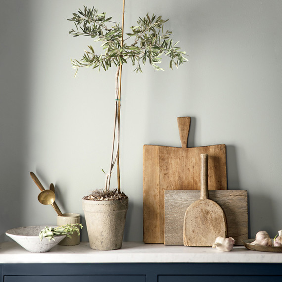
Unfortunately the two other colours of the year were not quite the success anticipated, in our opinion at least. Benjamin Moore kept things extremely safe by choosing Metropolitan as their colour of the year, which is… grey. Just grey. Now don’t get us wrong, we love grey! It’s a classic, will always work, always neutral, but it’s had it’s minute we can all agree. Colour of the Year is supposed to be a projection, something new! It is a beautiful colour but this just isn’t it for us. Use it in conjunction with a bolder shade, pair with nautical navy shades or some bold blacks.
Lastly, on the entirely opposite end of the excitement spectrum is Pantone! If Benjamin Moore didn’t give us enough, then Pantone might have given us too much. Pantone have named Living Coral as their Colour of the Year. It’s lovely, coral is a fantastic accent colour, but that’s where it shall be left. In accents. So if you’re feeling bold and brave with your kitchen accents then perhaps venture into the coral-scape, but avoid cabinetry and walls at all costs!
